 爱华网
爱华网即:
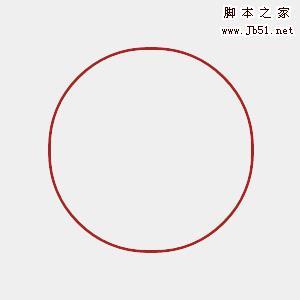
Firefox支持border-radius(圆角):-moz-border-radius:10px;
webkit内核的Safari和Chrome支持border-radius(圆角):-webkit-border-radius:10px;
Opera支持border-radius(圆角):border-radius:10px;
IE不支持border-radius(圆角)
效果图:(IE和遨游不支持!)
代码:
<!DOCTYPE html PUBLIC "-//W3C//DTD XHTML 1.0 Transitional//EN" "http://www.w3.org/TR/xhtml1/DTD/xhtml1-transitional.dtd">
<html xmlns="http://www.w3.org/1999/xhtml">
<head>
<meta http-equiv="Content-Type" content="text/html; charset=utf-8" />
<title>圆角效果border-radius</title>
<style type="text/css">
body,div{margin:0;padding:0;}
.border{width:200px;border:10px solid gray;height:20px;
-moz-border-radius:10px;/*仅Firefox支持,实现圆角效果*/
-webkit-border-radius:10px;/*仅Safari,Chrome支持,实现圆角效果*/
-khtml-border-radius:10px;/*仅Safari,Chrome支持,实现圆角效果*/
border-radius:10px;/*仅Opera,Safari,Chrome支持,实现圆角效果*/
}
</style>
</head>
<body>
<div>border radius</div>
</body>
</html>
再此我们还可以随意指定圆角的位置,上左,上右,下左,下右四个方向。
在firefox、webkit内核的Safari,Chrome和 Opera的具体书写格式如下:
上左效果:
-moz-border-radius-topleft / -webkit-border-top-left-radius / border-top-left-radius 上左
上右效果:
-moz-border-radius-topright / -webkit-border-top-right-radius / border-top-right-radius 上右
下左效果:
-moz-border-radius-bottomleft / -webkit-border-bottom-left-radius / border-bottom-left-radius 下左
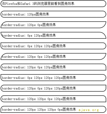
下右效果:
-moz-border-radius-bottomright / -webkit-border-bottom-right-radius /border-bottom-right-radius 下右
然后我们可以做些效果:
例如常见的 标题栏 仅仅需要在上面用到圆角效果,如图:
代码 :
<!DOCTYPE html PUBLIC "-//W3C//DTD XHTML 1.0 Transitional//EN" "http://www.w3.org/TR/xhtml1/DTD/xhtml1-transitional.dtd">
<html xmlns="http://www.w3.org/1999/xhtml">
<head>
<meta http-equiv="Content-Type" content="text/html; charset=utf-8" />
<title>圆角效果border-radius</title>
<style type="text/css">
.border{width:120px;border:15px solid gray;height:20px;
background:gray;color:#fff;
-moz-border-radius-topright:15px;
-moz-border-radius-topleft:15px;
-webkit-border-top-right-radius:15px;
-webkit-border-top-left-radius:15px;
border-top-right-radius:15px;
border-top-left-radius:15px;
}
</style>
</head>
<body>
<div>border radius</div>
</body>
</html>
代码:
<!DOCTYPE html PUBLIC "-//W3C//DTD XHTML 1.0 Transitional//EN" "http://www.w3.org/TR/xhtml1/DTD/xhtml1-transitional.dtd">
<html xmlns="http://www.w3.org/1999/xhtml">
<head>
<meta http-equiv="Content-Type" content="text/html; charset=utf-8" />
<title>圆角效果border-radius</title>
<style type="text/css">
.border{width:120px;border:15px solid gray;height:20px;
background:gray;color:#fff;
-moz-border-radius-topright:15px;
-moz-border-radius-bottomleft:15px;
-webkit-border-top-right-radius:15px;
-webkit-border-bottom-left-radius:15px;
border-top-right-radius:15px;
border-bottom-left-radius:15px;
}
</style>
</head>
<body>
<div>border radius</div>
</body>
</html>
阴影效果
-webkit-box-shadow: #000 0px 0px 10px这个代码非常不错可以做DIV投影。代码分析,第一个0PX是往右移动多少像素,第二个0PX往下移动多少像素最后一个是投影大小。
万变不离其宗,仅仅需要改下的border-radius的方向,就可以实现一些很有用的效果,代码变的越来越简单。