来源:http://pixelresort.com/blog/icons-and-logos-are-not-the-same/#shareContainer
在此感谢nangeyi的翻译~
ICONS ANDLOGOS ARE NOT THE SAME/图标和标志的区别
I often stumple upon the confusion between icon andlogo design. While logos may use the same visual vocabulary asicons, let there be no doubt; Icons and Logos are two completelyseparate design disciplines requiring different tools and differentmindsets.
我通常在图标设计和标志设计之间犯迷糊。虽然标志和图标的具有同样的视觉语言,但是图标和标志是两个完全独立设计学科需要不同的工具和不同的心态对待。这是毋庸置疑的。
The gap between the designersvocabularyand theclientsknowhowcan cause someproblematic confusions. To alleviate this lets look at what an iconis, what a logo is and how these two things could come to beconfused.
设计师的语言和客户之间的差距是知道它们怎样引起一些棘手的混淆。为了消除这种混淆,让我们看看什么是图标,什么是标志以及这两件事是怎样混在一起的。
WHAT’S AN ICON?/什么是图标?
Apart from any religious denotations an icon is a graphicalrepresentation of a concept or operation. We use icons to bridgethe understanding of abstract analogies and practical use. Iconscan be used to illustrate an entire application or individualoperations within that application. In short, icons help usunderstand and recognize concepts that might otherwise be prettyhard to grasp.
除了任何宗教意义暗示之外,图标是一个概念和运作的图形呈现。我们使用图标在理解抽象概念和实际操作方面架起了一座桥梁。图标可以用来说明整个应用程序或个人业务的申请操作。简言之,图标帮助我们理解和认知概念,没有它的话可能会相当难。
I could write a very long article about the whimsical nature oficon conventions and the semiotics that guide these, but in thiscase it’s more relevant to look at the technical differences thatis so fundamental for icon design and how these differ from logodesign.
我可以写一篇很长的关于图标规则、性质及符号方面的文章来阐述。但是在这篇文章中,它更多涉及的是图标设计的基础--技术层面的不同。以及怎样把这些技术与标志设计技术区别开来。
ICONS ARE NOT SCALABLE/图标没有扩展性
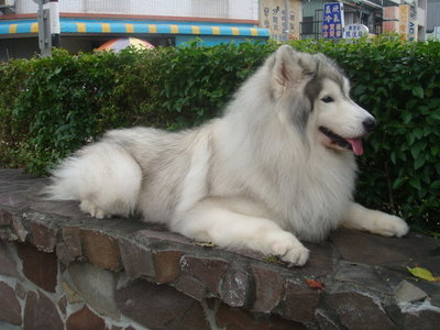
More than often, icons are not scalable. The very idea of icons areto best convey a given message within a predetermined confinedvisual space. In today’s iconcentric interfaces we allow formultiple variations of the same icon. The icons that are sitting inyour dock most likely have atleast 5 different states embedded,making them appear crisp in all aspects of your interaction withthem. List view in OSX gives you the 16×16 pixel version while thedock uses the 256×256 pixel adaptation. These are not scalablevector versions, they are handcrafted raster masterpieces. Thecreator must carefully select how to best take advantage of thecanvas in any given size and more than often completely recreatethe icon in those sizes.
通常,图标不是可扩展的。这一图标理念的能够很好的传达局限在预定视觉空间信息。在今天的iconcentric界面中,我们允许在同一图标中的多样变化。比如下图的5个图标的不同尺寸,它们能使你在不同环境中轻松的操作系统。视图中给的系统设置-16×16像素版本而任务栏里采用适合的256×256像素的图标。这些都不是可扩展的向量的版本,他们是手工调整的杰作(不是随便的放大,缩小)。设计者应该认真选择如何最好地利用画布尺寸,在这些给定的有限的画布上再创作在图标。
My manilla mail icon in it’s various states.Note the different layout of the elements in the smaller sizes.
ICONS ARE QUADRATIC/图标是二次型
Icons operate within a complete square canvas. How you choose toemploy that canvas is up to you, but it’s restricted to thatstraight edged space.
图标是在一个正方形画布里运作的。究竟选择多大的画布由你自己决定,但是你必须严格按照这种直的空间。
Icons are created on a neatly defined andrestricted canvas
So that’s it. Icons are not scalable, they’re handcrafted rasterimagery born from the desire to objectify an operation or a conceptwithin a confined visual space. How does this differ from alogo?
正如上述,图标是不可扩展的。他们被赋予一定的意义,阐述它来自欲望,想想具化为实际操作或者是限定视觉空间的概念。
WHAT’S A LOGO?/标志是什么
A logo is a graphical element like an ideogram and/or a carefullyarranged typeface that together forms a trademark or a brand.There’s an infinite amount of ways to think about logos and logodesign. Again, the important thing here is to look at the technicaldifferences from icon design.
标志是一个图形元素如文字符号/或一个精心安排的字体,组成一个商标或品牌。我们有无限的方式去思考标志和标志的设计。当然现在最重要的就是看看标志设计与图标设计在技术上的不同。
LOGOS ARE SCALABLE/标志具有可扩展性
A logo should be completely scalable. A logo is the spearhead of acompany’s commercial brand or any economic or non profit entity forthat matter. Therefore a logo should be replicatable across manyforms of media. This has great impact on the sort of mindset youneed to bring when designing logos. We’re talking strictlyvectorbased output and more than often, graceful degeneration ofcolours all the way down to uni colours.
一个标识应该完全可扩展性。一个标志是一家公司的商业品牌或任何经济或非盈利单位的标识。所以一个标志应该可以在许多形式的媒介上传播。这些将对你的思维方式有很大的影响,当你在做设计的时候因该考虑这些因素。我们需要经常严格的矢量输出。
Logos are supposed to be scalable.
LOGOS HAVE NO BOUNDARIES/标志是界限的
Well in theory a logo could be anything. Other than the obviousbenefits of working in a format that is easily scalable andreplicatable there really is very little rules compared to icondesign. Icon design is very influenced by technical dimensions andthe restrictions of the systems that display them. Logo design is acompletely different venue. A logo could be any shape, colour ordimension – it can be waved from a 100 feet banner or tattooed on abutt cheek. It’s only constraint is that of the physical media thatwill display it.
从理论来讲标志可以是任何事物。除了有明显的禁锢和限制的东西,标志与图标相比很少有规则来限制。图标设计很受技术的尺寸和显示设备的影响。而标志设计则和它不同。一个标识可以是任何形状,颜色和尺寸-(它可以大到100尺的旗帜,小到纹在身上的小图案)。标志唯一受限于展示他的媒介。
WHY ARE WE CONFUSED?/我们为什么会混淆呢?
Icons have taken a very prominent role in modern interfaces. Thishas obviously spilled over to the realm of branding where manyicons serve both as application icon and branding for thatentity.
图标在现代的界面媒体中扮演着很重要的角色。这显然蔓延到许多需要用图标作为应用系统指示和品牌标识的领域。
Panic creates excellent software and uses theirapplication icons as product branding
This wave of iconism™ (yes, I just invented that for this purpose)has influenced many graphic designers and a lot of the appealingaspects of the cartoony and crafty iconized style has made it’s wayto modern logo design trends. Infact this style has become theposterchild for the web 2.0 movement, and such many internetbasedfirms have logos that uses the same visual vocabulary as icons.
这“iconism™(是的,我刚刚发明,为了这个目的)运动已经影响了许多图形的设计者,并且这种模糊的crafty iconized风格使它发展成现代标志设计的新趋势。事实上这种风格在web2.0的运动中就有了苗头,像很多以互联网的企业标识使用图标来表达相同视觉含义。
Logos inspired by an Iconistic style
And while logos can certainly employ an icon-like style, and evenmimic the quadratic nature of icons. Let there be no doubt, Iconsand Logos are two completely separate design disciplines. It’simportant to know the difference between these two things, as theyinheretly seek out to fulfil two very different goals, bothtechnically and mentally.
当然,标志在某总程度上能够模仿图标似的风格,甚至是模仿大自然的二次图标。不要怀疑,图标和标志是两个完全独立设计范畴。重要的是知道两者之间的区别,因为他们本来寻求两种截然不同的目标,无论是在技术上还是在精神上的。
Below I’ve included a PSD template that supplies you with thecanvas in the correct dimensions for making your own icons. If youwanna talk icon or logo designthrowme an emailor just have a look atmyservices page.
If you liked this article, why notcommentand/ortweetabout it. You can also hit me up on that thing called