用R画误差线
http://monkeysuncle.stanford.edu/?p=485
http://wangyufeng222.blog.163.com/blog/static/1282220702011112753055713/
Plotting Error Bars in R
August 24th, 2009 · 52 Comments
One common frustration that I have heard expressed about R isthat there is no automatic way to plot error bars (whiskers really)on bar plots. I just encountered this issuerevising a paper for submission and figured I'd share my code.The following simple function will plotreasonable error bars on a bar plot.
PLAIN TEXT
R:
error.bar <-function(x, y,upper, lower=upper,length=0.1,...){
if(length(x)!= length(y) |length(y)!=length(lower)| length(lower)!=length(upper))
stop("vectors must be samelength")
arrows(x,y+upper,x, y-lower,angle=90,code=3,length=length,...)
}
Now let's use it. First, I'll create 5 meansdrawn from a Gaussian random variable with unit mean and variance.I want to point out another mild annoyance withthe way that R handles bar plots, and how to fix it.By default, barplot() suppresses the X-axis.Not sure why. If you want theaxis to show up with the same line style as the Y-axis, include theargument axis.lty=1, as below. By creating an object to hold yourbar plot, you capture the midpoints of the bars along the abscissathat can later be used to plot the error bars.
PLAIN TEXT
R:
y <-rnorm(500,mean=1)
y <-matrix(y,100,5)
y.means <-apply(y,2,mean)
y.sd <-apply(y,2,sd)
barx <-barplot(y.means,names.arg=1:5,ylim=c(0,1.5),col="blue",axis.lty=1,xlab="Replicates", ylab="Value (arbitraryunits)")
error.bar(barx,y.means,1.96*y.sd/10)
Now let's say we want to create the very common plot in reportingthe results of scientific experiments: adjacent bars representingthe treatment and the control with 95% confidence intervals on theestimates of the means. The trick here is tocreate a 2 x n matrix of your bar values, where each row holds thevalues to be compared (e.g., treatment vs. control, male vs.female, etc.). Let's look at our same Gaussian means but nowcompare them to a Gaussian r.v. with mean 1.1 and unitvariance.
PLAIN TEXT
R:
y1 <-rnorm(500,mean=1.1)
y1 <-matrix(y1,100,5)
y1.means <-apply(y1,2,mean)
y1.sd <-apply(y1,2,sd)
yy <-matrix(c(y.means,y1.means),2,5,byrow=TRUE)
ee <-matrix(c(y.sd,y1.sd),2,5,byrow=TRUE)*1.96/10
barx <-barplot(yy,beside=TRUE,col=c("blue","magenta"),ylim=c(0,1.5),names.arg=1:5,axis.lty=1,xlab="Replicates", ylab="Value (arbitraryunits)")
error.bar(barx,yy,ee)
Clearly, a sample size of 100 is too small to show that themeans are significantly different. The effect size is very smallfor the variability in these r.v.'s. Try10000.
PLAIN TEXT
R:
y <-rnorm(50000,mean=1)
y <-matrix(y,10000,5)
y.means <-apply(y,2,mean)
y.sd <-apply(y,2,sd)
y1 <-rnorm(50000,mean=1.1)
y1 <-matrix(y1,10000,5)
y1.means <-apply(y1,2,mean)
y1.sd <-apply(y1,2,sd)
yy <-matrix(c(y.means,y1.means),2,5,byrow=TRUE)
ee <-matrix(c(y.sd,y1.sd),2,5,byrow=TRUE)*1.96/sqrt(10000)
barx <-barplot(yy,beside=TRUE,col=c("blue","magenta"),ylim=c(0,1.5),names.arg=1:5,axis.lty=1,xlab="Replicates", ylab="Value (arbitraryunits)")
error.bar(barx,yy,ee)
That works. Maybe I'll show some code for doing powercalculations next time...
Tags: R
R画误差线:Plotting Error Bars in R
2011-12-27 17:32:06|分类: R、SVG&GNUPlot画| 标签:rerro|字号订阅
>error.bar<- function(x, y, upper, lower=upper,length=0.1,...){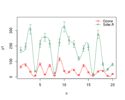
+if(length(x)!= length(y) | length(y) !=length(lower) | length(lower) !=length(upper))
+stop("vectorsmust be same length")
+arrows(x,y+upper,x, y-lower, angle=90, code=3, length=length, ...)
+}
>
>y<- rnorm(500, mean=1)
>y<- matrix(y,100,5)
>y.means<- apply(y,2,mean)
>y.sd<- apply(y,2,sd)
>barx<- barplot(y.means, names.arg=1:5,ylim=c(0,1.5),col="blue", axis.lty=1, xlab="Replicates", ylab="Value (arbitraryunits)")
>error.bar(barx,y.means,1.96*y.sd/10)
结果如下:
本文地址:http://mymajia.diandian.com/post/2013-05-20/40051551398