—1—————————————————————————————————
Logo name: Building ExplorerLLC
Nation: Serbia
Agency: SystemPro
Designer(s): IvanApostolski
Client: Building ExplorerLLC
Description: Bulding Explorer isa company specializing in BIM (Building Information Model) softwaresolutions. BIM software facilitates the building process by givingfull control of the construction project and its costs.
标志名称:建设资源管理有限责任公司
国家:塞尔维亚
机构:SystemPro
设计师(补):伊万Apostolski
客户:建立资源管理器有限责任公司
说明:Bulding Explorer是一个公司的BIM(建筑信息模型)软件解决方案。BIM软件有助于通过给予建设项目和费用完全控制建设进程。
—2—————————————————————————————————
Wolda Professional awards Bestof Europe Best of Spain
Logo name: Sancti SpíritusWines
Nation: Spain
Agency: El Paso, Galería de Comunicación
Designer(s): Álvaro Pérez
Client: La Repostería de las Monjas
Description: An easy logo in just black ink with differentmeanings: the black wine bottle, the corkscrew, the two "S" of thename, and the "v" of "vinos" (wines in spanish).Score: 111
标志名称:圣斯皮里图斯葡萄酒
国家:西班牙
机构:埃尔帕索,加莱里亚通信
设计师(补):阿尔瓦罗佩雷斯
客户:修女的甜品
说明:在短短的黑色墨水有不同的含义简单图案:黑色葡萄酒瓶,开瓶器,两个“S”的名称,并在“V”的“葡萄酒(葡萄酒在西班牙)。
—3—————————————————————————————————
Wolda Professionalawards
Best of Germany
Logo name: Mea Stella
Nation: Germany
Agency: BÜRO ALBA
Designer(s): Christian Rother,Tina M. Strobel, Daniela Rudolf, Nadine Förtsch
Client: Mea Stella
Description: Mea Stella is anevent and booking agency for stars and artists. The logo emergedfrom the italian expression „mea stella“, whichmeans „my star“ and the surname of the founder and head of theagency Finke (engl. Finch), which is the name of a certain speciesof birds.
Wolda专业奖项
德国最佳
标志名称:Mea斯特拉
国家:德国
机构:BÜRO阿尔瓦
设计师(补):基督教勒特尔,蒂娜米斯特罗贝尔,丹妮拉鲁道夫,纳迪娜Förtsch
客户:Mea斯特拉
描述:Mea斯特拉是一个事件和明星和艺术家订舱代理。这个标志出现了来自意大利的表达“MEA的斯特拉”,意思是“我的明星”和创办人的姓氏和该机构的芬克(engl.芬奇),这是有一定的鸟类种名头。
—4—————————————————————————————————
Logo name: BIG BOSS
Nation: Ukraine
Agency: Graphic design studio byYurko Gutsulyak
Designer(s): YurkoGutsulyak
Clien————t: BIG BOSS
Description: BIG BOSS (IT -technologies) This is a real specialist in its sphere ofactivities. An odd wise head that always knows the correct answersto all questions and is respected because of his authority in theIT world. On the first sight, he doesn’t look like a big boss;however, it is him who controls the whole situation.
标志名称:大老板
国家:乌克兰
机构:图解Yurko Gutsulyak设计工作室
设计师(补):Yurko Gutsulyak
客户:大老板
说明:大老板(资讯科技 -技术)这是一个在其活动范围真正的专家。一个奇怪的大洞吃苦,总是知道正确的答案是,因为所有的问题和他在IT界权威的尊重。在第一次看到,他看起来并不像一个大老板,但他是谁控制了整个局势。
—5—————————————————————————————————
Logo name: Fattoria diOpagna
Nation: Italy
Agency:molly&partners
Designer(s): Francesco MariaGiuli
Client: Fattoria diOpagna
Description: The emblem isdesigned to represent the Opagna Farm (located in Umbria) and thevalues of natural and tasty nourishment. The farm produces freshcheeses using milk of biologically bred cows in an absolutelynatural environment. Freshness and taste of these products areobtained by milk-cows of the following breeds: red, black and whiteand Italian Frisian. The emblem: the emblem represents a cow udderwith three nipples which recalls the three above mentioned breeds.Simple, but with a strong visual impact, it immediately recalls thecontact with nature and the reference to the natural and healthytaste of milk which is the main element of the products of thefarm. Colour: green like grass and pastures
标志名称:Fattoria迪Opagna
国家:意大利
机构:莫莉和合作伙伴
设计师(补):弗朗西斯玛丽亚朱利
客户:Fattoria迪Opagna
说明:会徽设计,以代表Opagna农场(在翁布里亚所在地),自然和美味营养的价值。使用该农场生产的自然环境中处于绝对的生物繁殖牛所产牛奶的新鲜奶酪。这些产品的新鲜度和口感,得到了牛奶以下品种奶牛:红色,黑色和白色,意大利弗里斯兰。会徽:会徽是一个有三个乳头其中回顾上述三个品种的奶牛乳房。简单,但具有较强的视觉冲击,它会立即回顾与自然以及对自然健康的牛奶的味道这是该场产品主要元素参考联系。颜色:绿如草和牧场
—6—————————————————————————————————
Logo name: Ryan-BiggsAssociates
Nation: United States
Agency: id29
Designer(s): Bryan Kahrs
Client: Ryan-Biggs Associates, P.C.
Description: Ryan-Biggs is an engineering consultancy with aprimary focus on structural engineering. Our solution combined thetwo primary letter forms of the client's name in a dimensional formthat implies structural depth.
标志名称:瑞安-比格斯协会
国家:美国
机构:id29
设计师(补):布赖恩Kahrs
客户端:瑞安-比格斯协会,P.C.
描述:瑞安-比格斯了一期结构工程的主要重点工程顾问。我们的解决方案合并成一个立体的结构形式,意味着深入的客户的姓名字母的两种主要形式。
—7—————————————————————————————————
Logo name:Mashreq logo
Nation: United States
Agency: Lippincott
Designer(s): Alex de Janosi, Jenifer Lehker, SamAyling
Client: MashreqBank
Description: As ‘mashreq’ translates to ‘dawn’,the identity conveys a rising sun and the new positioning ofopenness: the financial promise of “opening opportunities”, theservice promise of “opening access” and the more human,relationship promise of “opening up”.
标志名称:标志阿拉伯马什雷克
国家:美国
机构:利平科特
设计师(补):亚历德Janosi,珍妮弗Lehker,萨姆艾林
客户:银行阿拉伯马什雷克
介绍:'阿拉伯马什雷克'转化为'曙光'的身份传达出一个升起的太阳和开放的新定位:“开放的机遇”的金融承诺,“开放访问”和更多的人力,关系承诺的服务承诺“开放”。
—8—————————————————————————————————
Logo name:EPROMOTORES
Nation: Spain
Agency: ZORRAQUINO
Designer(s): Miren Sánchez,Miguel Zorraquino
Client: EPROMOTORES Grupo GestorInmobiliario
Description: Three partitions;cubicles; the letter E; This is the graphic sign that identifiesstate agents EPROMOTORES, Grupo Gestor Inmobiliario, a sign whichplays with two- and three-dimensional images and conveys theconstruction element through a 3-D representation of the letter E(the “Brand Identity”), that also forms different spaces,compartments, dwellings... The result is a solid, modern brandwhich is closely related to society and its activities.
标志名称:EPROMOTORES
国家:西班牙
机构:ZORRAQUINO
设计师(补):Miren桑切斯,米盖尔Zorraquino
客户:EPROMOTORES Grupo Gestor Inmobiliario
说明:三个分区;房间,字母E,这是标识的图形符号国家代理人EPROMOTORES,Grupo GestorInmobiliario,一块牌子,上面有两个次和三维图像,并通过传递的3 -D代表性的建筑元素字母E(以下简称“品牌形象”),这也形成了不同的空间,车厢,住宅...其结果是坚实的,现代的品牌,是密切相关的社会,其活动。
—9—————————————————————————————————
Wolda Professional awards Bestof Cyprus
Logo name: Asteria Bar
Nation: Cyprus
Agency: T&E Polydorou Design
Designer(s): Tasos Polydorou
Client: Miramare Hotel - Limassol
Description: Asteria is the outdoor bar of the Atlantica MiramareHotel, a 4-star hotel in Limassol, one of the most popular seasideresorts on the island of Cyprus. The name is the plural form of theword "asteri", which means "star" in Greek. The blue colour waschosen to emphasize the bar's location overlooking the sea, themartini glass to represent a bar, and the star to indicate anoutdoor venue under starry Mediterranean skies. The movement oflines expresses liveliness, happy hour, and in general the mood ofthis popular bar.
Wolda专业奖项
最佳塞浦路斯
标志名称:阿斯特里亚酒吧
国家:塞浦路斯
机构:商旅酬酢Polydorou设计
设计师(补):Tasos Polydorou
客户:Miramare酒店宾馆 - 利马索尔
说明:阿斯特里亚是王者Miramare酒店宾馆,在利马索尔,在关于塞浦路斯岛最受欢迎的海滨度假胜地之一的四星级酒店的露天酒吧。这个名字是单词“asteri”,意思是“明星”在希腊语中的复数形式。蓝色被选为强调栏的位置,俯瞰大海,马提尼酒杯,代表一间酒吧,和明星指示地中海的天空繁星下一个室外场地。该行表示运动活泼,欢乐时光,和一般这个受欢迎的酒吧心情。
—10—————————————————————————————————
Logo name: MarienorgelWitten
Nation: Germany
Agency: Claudius Design
Designer(s): Stefan Claudius
Client: Katholische Kirchengemeinde St. Maien Witten
Description: The Church of Witten is building a new organ, whichwill be one of the largest in the region. Part of the publicitycampaign is the logo. It is based on the labiums of the visibleflutes of the new organ. Labiums are the source of the sound of anorgan. In the logo they stand for musicality, bringing in mind theflow of music. The organ’s colours will be red andwhite.
标志名称:Marienorgel威滕
国家:德国
机构:克劳迪斯设计
设计师(补):斯特凡克劳迪斯
客户:Katholische Kirchengemeinde圣Maien威滕
说明:威滕教会正在建设一个新的器官,这将是该地区最大的之一。的宣传运动的一部分,是标志。它是根据新的器官可见笛子的labiums。Labiums是一机关声源。会徽中的音乐,他们主张,考虑为推动音乐流。该机关的颜色将是红色和白色。
—11—————————————————————————————————
Logo name: eko_unia
Nation: Poland
Agency: logotypy.com
Designer(s): Marcin Lagocki
Client: eko_Unia
Description: Eko_Unia is an organisation involved mainly ineducation about ecology and natural environment. Eko_Unia alsoorganises teacher-oriented workshops about ecology, recycling,etc.
标志名称:eko_unia
国家:波兰
机构:logotypy.com
设计师(补):马尔钦Lagocki
客户:eko_Unia
说明:Eko_Unia主要是在大约生态和自然环境教育工作的组织。Eko_Unia还组织有关生态,环保等教师为导向的讲习班
—12—————————————————————————————————
Logo name: Ulitka (Snail)Hotel
Nation: RussianFederation
Agency: altapress
Designer(s): AlexeyShelepov
Client: Altan
Description: The snail went offon a journey - leaving its shell. The mollusk transforms intoarabesque image of a doorlock key. Even though today all rooms inthe hotel open with electronic keys, the image of traditional keyis still a very convincing symbol of hotel business. Moreover, thehistoric image of a key has always been used as a citysymbol.
标志名称:Ulitka(蜗牛)酒店
国家:俄罗斯联邦
机构:altapress
设计师(补):阿列克谢Shelepov
客户:俺答
描述:蜗牛去了一个旅程 -离开它的外壳。软体动物转变成一个门锁钥匙蔓藤花纹的形象。虽然今天在酒店用电子钥匙打开所有的客房,传统的形象仍然是一个关键的酒店业务非常有说服力的象征。此外,一个关键的历史的形象一直被用来作为一个城市的象征。
—13—————————————————————————————————
Logo name: UMW logo
Nation: United States
Agency: Lippincott
Designer(s): Connie Birdsall, Rodney Abbot, Richard Wilke, SteveLawrence, Vincenzo Perri, Bogdan Geana, Shelby Hawker
Client: UMW
Description: UMW is an international conglomerate that developsindustries, manages partnerships and facilitates growth. The “U”symbol is a reference to “United”, from the original company name(United Motor Works), and a symbol of the unity of purpose of itsoperating companies. The symbol appears to shimmer as itsindividual elements twist and rotate, enhanced by a shift in colorfrom a bright blue to a warm orange. This rhythmic repetition andthe rich color palette creates a strong sense of movement –symbolic of the vibrant character of UMW and its people, and theability to transform in synchrony with ever changing marketconditions.
标志名称:市区小徽标
国家:美国
机构:利平科特
设计师(补):康妮伯德索尔,罗德尼住持,理查德威尔克,史蒂夫劳伦斯,Vincenzo佩里,波格丹Geana,谢尔比小贩
客户:市区小
说明:市区小工程是一个国际集团公司,发展产业,管理伙伴关系和促进增长。的“U”符号是一个“联合”,参考从原公司名称(联合汽车工程),以及其对公司经营的宗旨团结的象征。符号似乎微光作为单个元素扭曲和旋转,由明亮的颜色从蓝色转变为温暖的橙色增强。这种有节奏的重复和丰富的色彩调色板创建了一个强烈的运动感- 对市区小工程和它的人民充满活力的象征性人物,并有能力在同步变换与不断变化的市场条件。
—14—————————————————————————————————
Logo name: Johnson Controlslogo
Nation: United States
Agency: Lippincott
Designer(s): Rodney Abbot,Christian Dierig, Bogdan Geana
Client: JohnsonControls
Description: Johnson Controlsunique ability to create appealing environments for customersacross many areas of their lives—homes, cars and offices isexpressed in the design of the new logo. The symbol representsvitality and energy. The interweaving rings or “waves”, reflect theexchange of ideas, dialog and engagement with customers andemployees. The abstraction of the initials “JC“ can be read as themovement of air, the transfer of energy, interaction and wirelesstransmission… recalling core elements of the businesses.
标志名称:江森自控徽标
国家:美国
机构:利平科特
设计师(补):罗德尼住持,基督教Dierig,波格丹Geana
客户:江森自控
说明:江森自控能力,创造独特的呼吁在他们的生活,住房,汽车和办公室的许多领域,是在新徽标的设计表示客户环境。符号代表的活力和能量。交织环或“浪”,反映了思想,对话和与客户和员工的参与交流。该缩写“赛马”,可作为空气流动,能源,互动和无线传输传输读取...回顾企业的核心元素抽象。
—15—————————————————————————————————
Logo name: EnvironmentalCurriculum Service
Nation: UnitedKingdom
Designer(s): JamesTredray
Client: Wide Horizons
Description: The EnvironmentalCurriculum Service delivers a whole range of outdoor andenvironmental education provision for schools, colleges and othereducational establishments.The simple brief was to revamp the oldoak tree logo and make it softer, more youth friendly than theprevious mark. Using simple circular shapes the designer createdthe tree using the ECS initials.
标志名称:环境课程服务
国家:英国
设计师(补):詹姆斯Tredray
客户:宽视野
说明:环境课程服务提供了户外和环保为学校,学院和其他教育establishments.The简单简短提供教育整体改革的范围是在老橡树标志,并使其更柔软,比以前更多的青年友好标记。使用简单的圆形状的设计师建立的树用精英的缩写。
—16—————————————————————————————————
Logo name: ACCEDE
Nation: Spain
Agency: Valladares diseño y comunicacion
Designer(s): Pepe Valladares, Giovanni Vega
Client: Deloitte S.L.
Description: Logo for the “Sistema de Información de la Ley dePromoción de la Autonomía Personal y Atención a las Personas enSituación de Dependencia”, an information system that helps toapply a law by promoting the attention on people in dependancesituations
标志名称:爱可信
国家:西班牙
机构:设计和沟通Valladares
设计师(补):佩佩Valladares,乔瓦尼维加
客户:德勤sl的
说明:标识为“信息系统的法律对个人自主权和护理依赖者推介会”,一个信息系统,有助于促进依赖的申请依法由人民注意的情况
—17—————————————————————————————————
Logo name: Vale logo
Nation: United States
Agency: Lippincott
Designer(s): Connie Birdsall, Adam Stringer, Daniel Johnston,Brendán Murphy, Carlos Dranger, Isa Martins
Client: Vale
Description: Vale is the second largest mining company in the worldand one of Brazil’s biggest and most admired companies. It’s newvisual identity aims to consolidate its image as a Braziliancompany and increasing global presence, highlighting itsdistinctive position. The symbol, a "V" monogram, conveys visualqualities of landscape, discovery, mining and a circular,reciprocal type, motion — strength, elegance and humanistic in asingle expression, Brazilian in itscolorization.
标志名称:谷标识
国家:美国
机构:利平科特
设计师(补):康妮伯德索尔,亚当斯特林格,丹尼尔约翰斯顿,布伦丹墨菲,卡洛斯Dranger,伊萨马丁斯
客户:淡水河谷
说明:淡水河谷是世界第二大矿业公司和巴西的规模最大,最受尊敬的公司之一。它的新形象标志的目的是巩固和提高巴西公司全球业务的形象,突出其独特的地位。符号,一个“V”字母组合,传达视觉景观特质,发现,挖掘和一个圆形,互惠型,运动- 在一个单一的表达强度,优雅和人性化,在其着色巴西人。
—18—————————————————————————————————
Logo name: RJ Partners
Nation: Netherlands
Agency: Millford Brand-id
Designer(s): Jeroen de Kok
Client: RJ Partners
Description: The company RJ Partners BV in Amsterdam has it rootsin the finance market. The core business is corporate finance andinvestment management. The two owners have much experience in thismarket and decided to bundle their knowledge. The logo refers to asmall tree because the company is small. Although the company issmall, the knowledge cannot be underestimated. The roots visible inthe logo are deeply rooted and have many ranches. This refers tothe knowledge and big network of the company. 标志名称:个RJ合作伙伴
国家:荷兰
机构:米尔福德品牌的ID
设计师(补):吉荣德角
客户:个RJ合作伙伴
说明:本公司的RJ伙伴BV公司在阿姆斯特丹有它在金融市场根基。公司的核心业务是企业融资和投资管理。两位业主在这个市场很多经验,并决定捆绑他们的知识。这个标志是指一种小乔木,因为公司小。公司虽然小,知识不能被低估。在标志的根源是根深蒂固,可见有许多牧场。这是指以知识和公司的大网络。
—19—————————————————————————————————
Logo name: Master Plan MusicGroup
Nation: Korea, Republic of
Agency: Youngha Park
Designer(s): Youngha Park
Client: Master Plan Music Group
Description: Master Plan is a hip-hop music production company. TheClient aimed to a modern look for the company identity through theuse of some old school elements. The initials 'M' &'P' of Master Plan are combined to visualize a retro stainlesssteel microphone. It also shapes a fist which symbolizes the powerof hip-hop music. The target range audience is represented byTeenagers to mid age who love hip-hop music &musicians.
标志名称:音乐集团总体规划
国家:大韩民国
机构:Youngha公园
设计师(补):Youngha公园
客户:音乐集团总体规划
描述:总体规划是一个嘻哈音乐制作公司。客户的目的是为公司的身份通过一些老学校使用现代的外观元素。英文缩写的'M'和'P的总体规划相结合,看到一个不锈钢复古麦克风。它也塑造了一个拳头,象征嘻哈音乐的力量。目标范围观众的代表是谁适龄青少年到中爱嘻哈音乐与音乐家。
—20—————————————————————————————————
Logo name: KartaMira
Nation: Ukraine
Agency: Headshot branddevelopment
Designer(s): IgorDudka
Client: KartaMira
Description: This logosymbolizes the boundless opportunities for travelling. The journeysaround the world are waiting the clients of KartaMira travelcompany.
标志名称:KartaMira
国家:乌克兰
机构:爆头品牌发展
设计师(补):伊戈尔Dudka
客户:KartaMira
描述:这个标志象征着旅行的无限商机。世界各地的旅行则等待KartaMira旅游公司的客户。
—21—————————————————————————————————
Wolda Professional awards Bestof Slovenia
Logo name: Toko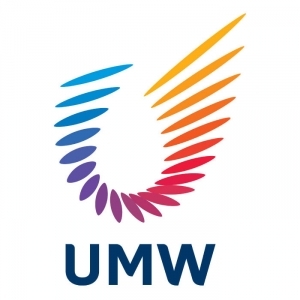
Nation: Slovenia
Agency: Armada
Designer(s): Teja Kleč, Darko Miladinović
Client: Toko d. o. o.
Description: Toko is a brand name of shops with prestigious baggageaccessories with a lasting tradition. The recognizable element ofthe new graphic design is a typical traveller - an origami birdthat leads the customers on a way around the world. Bird folded asneatly as you fold your belongings when you pack for yourjourney.
Wolda专业奖项
最好的斯洛文尼亚
标志名称:桃红
国家:斯洛文尼亚
机构:阿马达
设计师(补):Teja公司Kleč,达科Miladinović
客户:桃红四岛岛
描述:桃红是与著名的具有长久的传统行李配件商店的品牌名称。新的平面设计元素是一个典型的识别旅行 -一个折纸鸟,线索的方式在世界各地的客户。波导折叠整齐,你作为你的遗物时折为您的旅途包。
—22—————————————————————————————————
Logo name: Power logo
Nation: United States
Agency: Lippincott
Designer(s): Rodney Abbot, Bogdan Geana, Jenifer Lehker
Client: Power
Description: Power, a technology with its roots in IBM andFreescale Semiconductor, is used in a wide array of applications,from automotive control and telematics to home gaming consoles andmedia centers. In creating the identity, we sought to express thecontinuity and transformation of the Power Architecture platformand the endless possibilities it offers customers to innovate. Thesymbol expresses energy and vitality. As a fluid, organic object,it suggests openness, flexibility and agility. The logotypesuggests simplicity and directness and compliments the fluidsymbol. The brand color, green, communicates harmony, energy andfresh thinking.
标志名称:电源标志
国家:美国
机构:利平科特
设计师(补):罗德尼住持,波格丹Geana,珍妮弗Lehker
客户端:电源
描述:电源,与IBM和飞思卡尔半导体在其根技术,是用在多种应用,从汽车到家庭游戏控制和远程信息处理平台和媒体中心。在创建的身份,我们试图表达的连续性和Power架构平台的转型与创新是为客户提供无限的可能性。符号表示能量和活力。作为一个流体,有机对象,它表明开放性,灵活性和敏捷性。该标识表明简单和直接和赞扬流体的象征。该品牌颜色,绿色,和谐通信,能源和新思维。
—23—————————————————————————————————
Logo name: Nouveau Theatre deMontreuil
Nation: France
Designer(s): Delphine Cordierand Aurélie Gasche
Client: Nouveau Theatre deMontreuil
Description: This logo wascreated in November 2007 for the City of Montreuil's new theatre"le Nouveau Theatre de Montreuil" (France). The design of the logohas been inspired by the Institution's new building. Lines comingfrom different directions meet and inter-twine to finally draw theoutline of the building and thereby create its volume. It is themeeting point of exterior and interior. While the lines capture thetheatre, they also burst out of its confines. It represents theartistic dynamic of this place of creation and the internationalaspect of the Theatre's activities.
标志名称:德蒙特勒伊风格剧院
国家:法国
设计师(补):尔芬科迪尔和和Aurélie Gasche
客户:德蒙特勒伊风格剧院
描述:这个标志是2007年11月创造了市蒙特勒伊的新剧场“乐德蒙特勒伊风格剧场”(法国)。徽标的设计灵感来自该机构的新楼。线从不同方向满足和相互缠绕,最终绘制建筑物的轮廓和它的体积,从而创造未来。这是外部和内部的交汇点。虽然线条捕捉剧院,他们也迸发出它的局限。它代表了这个地方,创造了剧院的艺术活动的国际方面的动态。
—24—————————————————————————————————
Logo name: BrightHeartlogo
Nation: United States
Agency: Lippincott
Designer(s): Rodney Abbot, SamAyling
Client: BrightHeart VeterinaryCenters
Description: A group ofinvestors and specialist veterinarians developed a national chainof specialty clinics and requested a new brand. The logo is aninspired depiction of a pet’s toy, evoking both the restoration ofhealth and the playful moments when humans and animals joyfullyinteract. The suggestion of medical professionalism is enhancedthrough crisp typography, and a clean layout. Silhouettephotography against a bright, white backdrop, enhances the sense ofdedication and focus. Combined, the thoughtful placement of imageand symbol completes the picture of the pet’s journey to goodhealth, as the animals are seen active and engaged.
标志名称:BrightHeart标志
国家:美国
机构:利平科特
设计师(补):罗德尼住持,山姆艾林
客户:BrightHeart兽医中心
说明:对投资者和兽医专家小组制定了全国连锁的专科诊所,并要求新的品牌。这个标志是一个宠物的玩具启发的描述,同时唤起恢复健康,活泼的时刻,人类和动物的快乐互动。由于医疗专业的建议是通过清晰的排版增强,以及一个廉洁的布局。对一个明亮的轮廓,白色背景摄影,增强了奉献意识和重点。相结合,其形象和象征周到安排完成了对宠物的健康之旅照片,像动物被视为积极参与。
—25—————————————————————————————————
Logo name: Helga
Nation: Ukraine
Agency: Graphic design studio by Yurko Gutsulyak
Designer(s): Yurko Gutsulyak
Client: Helga
Description: Helga is a language learning centre. The sign wasinspired by crystal image and science fiction ideas, where crystalis associated to accumulating and storing information or knowledge,and also encourages mind reading. So it contributes to mutualunderstanding and communication. In such a way crystal reflectslanguage essence and functions. This sign suits the languagelearning center perfectly.
标志名称:埃尔加
国家:乌克兰
机构:图解Yurko Gutsulyak设计工作室
设计师(补):Yurko Gutsulyak
客户:埃尔加
说明:埃尔加是一门语言学习中心。该标志的设计灵感来自水晶影像和科幻小说的想法,其中晶体相关的积累和储存信息或知识,并鼓励心灵感应。因此,它有助于增进相互了解和沟通。在这种方式反映了语言的本质晶体和功能。这个标志适合的语言学习中心完美。