浏览相关设计网页的时候经常看到一些反复出现的LOGO,出于好奇经查阅,有些LOGO还是得过一些大奖的,很有意思。国外的很多LOGO做的很炫很酷,甚至还有是动态的,这在起初是无法理解的,LOGO怎么可以是动态的呢,设计师很牛能设计出这么出彩的作品,那甲方呢?客户能接受这些吗?国外客户的普遍接受能力应该要比中国强,中国人习惯性的求“稳”求“和谐”,不愿“与众不同”,这是一方面,另一方面,设计公司的卖稿能力也有的一说,他们是怎么去说服客户使用一个很炫很酷的LOGO呢,甚至有些奇怪。我们在工作中也会遇到一些问题,比如客户要一个LOGO,他强调要与众不同,要很前卫的很新锐的,但这个公司性质又是比较中国化的,设计师可以设计一个很简洁、很概念化的极具创意性的LOGO,但如何去说服客户呢,这是一个很关键的问题,总不能告诉他这个LOGO很酷我很喜欢,下面这些LOGO是我在国外网站上荡下来的,很棒的是每个LOGO都配有文字说明,名称、设计师、国家等,只不过是英文而已,下面这个中文翻译是我用google翻译一个个翻的,肯定不准确但完全可以满足我要的信息了,大家英文不好的可以看中文,一个个复制的好辛苦,(转载要注明出处哦,O(∩_∩)O哈哈~)。与此同时我看了一些国内大公司的LOGO设计说明,有些是出自名家之手,但设计说明却显得十分牵强,完全是些套话,这种解释可以拿来解释任何一个LOGO,如果这样也行的话一个LOGO的说明能写成一本小说那么厚,不过话又说回来,能扯也算是活,淡扯的好,有时烂设计也能卖个好价钱。好了不说了,看图~
Logo name: Building Explorer LLC
Nation: Serbia
Agency: SystemPro
Designer(s): Ivan Apostolski
Client: Building Explorer LLC
Description: Bulding Explorer is a company specializing in BIM(Building Information Model) software solutions. BIM softwarefacilitates the building process by giving full control of theconstruction project and its costs.
标志名称:建设资源管理有限责任公司
国家:塞尔维亚
机构:SystemPro
设计师(补):伊万Apostolski
客户:建立资源管理器有限责任公司
说明:Bulding Explorer是一个公司的BIM(建筑信息模型)软件解决方案。BIM软件有助于通过给予建设项目和费用完全控制建设进程。
_________________________________________________________________________________________________
Wolda Professional awards Best of Europe Bestof Spain
Logo name: Sancti Spíritus Wines
Nation: Spain
Agency: El Paso, Galeríade Comunicación
Designer(s): Álvaro Pérez
Client: La Repostería de las Monjas
Description: An easy logo in just black ink withdifferent meanings: the black wine bottle, the corkscrew, the two"S" of the name, and the "v" of "vinos" (wines in spanish).
Score: 111
Wolda专业奖项
欧洲最佳
最好的西班牙
标志名称:圣斯皮里图斯葡萄酒
国家:西班牙
机构:埃尔帕索,加莱里亚通信
设计师(补):阿尔瓦罗佩雷斯
客户:修女的甜品
说明:在短短的黑色墨水有不同的含义简单图案:黑色葡萄酒瓶,开瓶器,两个“S”的名称,并在“V”的“葡萄酒(葡萄酒在西班牙)。
_________________________________________________________________________________________________
Wolda Professional awards
Best of Germany
Logo name: Mea Stella
Nation: Germany
Agency: BÜRO ALBA
Designer(s): Christian Rother, Tina M. Strobel, Daniela Rudolf,Nadine Förtsch
Client: Mea Stella
Description: Mea Stella is an event and booking agency for starsand artists. The logo emerged from the italian expression „meastella“, which means „my star“ and the surname of the founder andhead of the agency Finke (engl. Finch), which is the name of acertain species of birds.
Wolda专业奖项
德国最佳
标志名称:Mea斯特拉
国家:德国
机构:BÜRO阿尔瓦
设计师(补):基督教勒特尔,蒂娜米斯特罗贝尔,丹妮拉鲁道夫,纳迪娜Förtsch
客户:Mea斯特拉
描述:Mea斯特拉是一个事件和明星和艺术家订舱代理。这个标志出现了来自意大利的表达“MEA的斯特拉”,意思是“我的明星”和创办人的姓氏和该机构的芬克(engl.芬奇),这是有一定的鸟类种名头。
_________________________________________________________________________________________________
Logo name: BIG BOSS
Nation: Ukraine
Agency: Graphic design studio by Yurko Gutsulyak
Designer(s): Yurko Gutsulyak
Client: BIG BOSS
Description: BIG BOSS (IT - technologies) This is a realspecialist in its sphere of activities. An odd wise head thatalways knows the correct answers to all questions and is respectedbecause of his authority in the IT world. On the first sight, hedoesn’t look like a big boss; however, it is him who controls thewhole situation.
Score: 76
标志名称:大老板
国家:乌克兰
机构:图解Yurko Gutsulyak设计工作室
设计师(补):Yurko Gutsulyak
客户:大老板
说明:大老板(资讯科技 -技术)这是一个在其活动范围真正的专家。一个奇怪的大洞吃苦,总是知道正确的答案是,因为所有的问题和他在IT界权威的尊重。在第一次看到,他看起来并不像一个大老板,但他是谁控制了整个局势。
_________________________________________________________________________________________________
Logo name: Fattoria di Opagna
Nation: Italy
Agency: molly&partners
Designer(s): Francesco Maria Giuli
Client: Fattoria di Opagna
Description: The emblem is designed to represent the Opagna Farm(located in Umbria) and the values of natural and tastynourishment. The farm produces fresh cheeses using milk ofbiologically bred cows in an absolutely natural environment.Freshness and taste of these products are obtained by milk-cows ofthe following breeds: red, black and white and Italian Frisian. Theemblem: the emblem represents a cow udder with three nipples whichrecalls the three above mentioned breeds. Simple, but with a strongvisual impact, it immediately recalls the contact with nature andthe reference to the natural and healthy taste of milk which is themain element of the products of the farm. Colour: green like grassand pastures
标志名称:Fattoria迪Opagna
国家:意大利
机构:莫莉和合作伙伴
设计师(补):弗朗西斯玛丽亚朱利
客户:Fattoria迪Opagna
说明:会徽设计,以代表Opagna农场(在翁布里亚所在地),自然和美味营养的价值。使用该农场生产的自然环境中处于绝对的生物繁殖牛所产牛奶的新鲜奶酪。这些产品的新鲜度和口感,得到了牛奶以下品种奶牛:红色,黑色和白色,意大利弗里斯兰。会徽:会徽是一个有三个乳头其中回顾上述三个品种的奶牛乳房。简单,但具有较强的视觉冲击,它会立即回顾与自然以及对自然健康的牛奶的味道这是该场产品主要元素参考联系。颜色:绿如草和牧场
_________________________________________________________________________________________________
Logo name: Ryan-Biggs AssociatesNation: United States
Agency: id29
Designer(s): Bryan Kahrs
Client: Ryan-Biggs Associates, P.C.
Description: Ryan-Biggs is an engineeringconsultancy with a primary focus on structural engineering. Oursolution combined the two primary letter forms of the client's namein a dimensional form that implies structural depth.
标志名称:瑞安-比格斯协会
国家:美国
机构:id29
设计师(补):布赖恩Kahrs
客户端:瑞安-比格斯协会,P.C.
描述:瑞安-比格斯了一期结构工程的主要重点工程顾问。我们的解决方案合并成一个立体的结构形式,意味着深入的客户的姓名字母的两种主要形式。
_________________________________________________________________________________________________
Logo name: Mashreq logo
Nation: United States
Agency: Lippincott
Designer(s): Alex de Janosi, Jenifer Lehker, SamAyling
Client: Mashreq Bank
Description: As ‘mashreq’ translates to ‘dawn’,the identity conveys a rising sun and the new positioning ofopenness: the financial promise of “opening opportunities”, theservice promise of “opening access” and the more human,relationship promise of “opening up”.
标志名称:标志阿拉伯马什雷克
国家:美国
机构:利平科特
设计师(补):亚历德Janosi,珍妮弗Lehker,萨姆艾林
客户:银行阿拉伯马什雷克
介绍:'阿拉伯马什雷克'转化为'曙光'的身份传达出一个升起的太阳和开放的新定位:“开放的机遇”的金融承诺,“开放访问”和更多的人力,关系承诺的服务承诺“开放”。
_________________________________________________________________________________________________
Logo name: EPROMOTORES
Nation: Spain
Agency: ZORRAQUINO
Designer(s): Miren Sánchez, Miguel Zorraquino
Client: EPROMOTORES Grupo Gestor Inmobiliario
Description: Three partitions; cubicles; the letter E; This isthe graphic sign that identifies state agents EPROMOTORES, GrupoGestor Inmobiliario, a sign which plays with two- andthree-dimensional images and conveys the construction elementthrough a 3-D representation of the letter E (the “BrandIdentity”), that also forms different spaces, compartments,dwellings... The result is a solid, modern brand which is closelyrelated to society and its activities.
标志名称:EPROMOTORES
国家:西班牙
机构:ZORRAQUINO
设计师(补):Miren桑切斯,米盖尔Zorraquino
客户:EPROMOTORES Grupo Gestor Inmobiliario
说明:三个分区;房间,字母E,这是标识的图形符号国家代理人EPROMOTORES,Grupo GestorInmobiliario,一块牌子,上面有两个次和三维图像,并通过传递的3 -D代表性的建筑元素字母E(以下简称“品牌形象”),这也形成了不同的空间,车厢,住宅...其结果是坚实的,现代的品牌,是密切相关的社会,其活动。
_________________________________________________________________________________________________
Wolda Professional awards Best of Cyprus
Logo name: Asteria Bar
Nation: Cyprus
Agency: T&E Polydorou Design
Designer(s): Tasos Polydorou
Client: Miramare Hotel - Limassol
Description: Asteria is the outdoor bar of theAtlantica Miramare Hotel, a 4-star hotel in Limassol, one of themost popular seaside resorts on the island of Cyprus. The name isthe plural form of the word "asteri", which means "star" in Greek.The blue colour was chosen to emphasize the bar's locationoverlooking the sea, the martini glass to represent a bar, and thestar to indicate an outdoor venue under starry Mediterranean skies.The movement of lines expresses liveliness, happy hour, and ingeneral the mood of this popular bar.
Score: 73
Wolda专业奖项
最佳塞浦路斯
标志名称:阿斯特里亚酒吧
国家:塞浦路斯
机构:商旅酬酢Polydorou设计
设计师(补):Tasos Polydorou
客户:Miramare酒店宾馆 - 利马索尔
说明:阿斯特里亚是王者Miramare酒店宾馆,在利马索尔,在关于塞浦路斯岛最受欢迎的海滨度假胜地之一的四星级酒店的露天酒吧。这个名字是单词“asteri”,意思是“明星”在希腊语中的复数形式。蓝色被选为强调栏的位置,俯瞰大海,马提尼酒杯,代表一间酒吧,和明星指示地中海的天空繁星下一个室外场地。该行表示运动活泼,欢乐时光,和一般这个受欢迎的酒吧心情。
分数:73
_________________________________________________________________________________________________
Logo name: KartaMira
Nation: Ukraine
Agency: Headshot brand development
Designer(s): Igor Dudka
Client: KartaMira
Description: This logo symbolizes the boundless opportunitiesfor travelling. The journeys around the world are waiting theclients of KartaMira travel company.
Score: 72
标志名称:KartaMira
国家:乌克兰
机构:爆头品牌发展
设计师(补):伊戈尔Dudka
客户:KartaMira
描述:这个标志象征着旅行的无限商机。世界各地的旅行则等待KartaMira旅游公司的客户。
分数:72
_________________________________________________________________________________________________
Logo name: Power logo
Nation: United States
Agency: Lippincott
Designer(s): Rodney Abbot, Bogdan Geana, JeniferLehker
Client: Power
Description: Power, a technology with its roots inIBM and Freescale Semiconductor, is used in a wide array ofapplications, from automotive control and telematics to home gamingconsoles and media centers. In creating the identity, we sought toexpress the continuity and transformation of the Power Architectureplatform and the endless possibilities it offers customers toinnovate. The symbol expresses energy and vitality. As a fluid,organic object, it suggests openness, flexibility and agility. Thelogotype suggests simplicity and directness and compliments thefluid symbol. The brand color, green, communicates harmony, energyand fresh thinking. 标志名称:电源标志
国家:美国
机构:利平科特
设计师(补):罗德尼住持,波格丹Geana,珍妮弗Lehker
客户端:电源
描述:电源,与IBM和飞思卡尔半导体在其根技术,是用在多种应用,从汽车到家庭游戏控制和远程信息处理平台和媒体中心。在创建的身份,我们试图表达的连续性和Power架构平台的转型与创新是为客户提供无限的可能性。符号表示能量和活力。作为一个流体,有机对象,它表明开放性,灵活性和敏捷性。该标识表明简单和直接和赞扬流体的象征。该品牌颜色,绿色,和谐通信,能源和新思维。
_________________________________________________________________________________________________
Logo name: Master Plan Music Group
Nation: Korea, Republic of
Agency: Youngha Park
Designer(s): Youngha Park
Client: Master Plan Music Group
Description: Master Plan is a hip-hop musicproduction company. The Client aimed to a modern look for thecompany identity through the use of some old school elements. Theinitials 'M' & 'P' of Master Plan are combined tovisualize a retro stainless steel microphone. It also shapes a fistwhich symbolizes the power of hip-hop music. The target rangeaudience is represented by Teenagers to mid age who love hip-hopmusic & musicians.
Score: 68
标志名称:音乐集团总体规划
国家:大韩民国
机构:Youngha公园
设计师(补):Youngha公园
客户:音乐集团总体规划
描述:总体规划是一个嘻哈音乐制作公司。客户的目的是为公司的身份通过一些老学校使用现代的外观元素。英文缩写的'M'和'P的总体规划相结合,看到一个不锈钢复古麦克风。它也塑造了一个拳头,象征嘻哈音乐的力量。目标范围观众的代表是谁适龄青少年到中爱嘻哈音乐与音乐家。
_________________________________________________________________________________________________
Logo name: Nouveau Theatre de Montreuil
Nation: France
Designer(s): Delphine Cordier and Aurélie Gasche
Client: Nouveau Theatre de Montreuil
Description: This logo was created in November 2007 for the Cityof Montreuil's new theatre "le Nouveau Theatre de Montreuil"(France). The design of the logo has been inspired by theInstitution's new building. Lines coming from different directionsmeet and inter-twine to finally draw the outline of the buildingand thereby create its volume. It is the meeting point of exteriorand interior. While the lines capture the theatre, they also burstout of its confines. It represents the artistic dynamic of thisplace of creation and the international aspect of the Theatre'sactivities.
标志名称:德蒙特勒伊风格剧院
国家:法国
设计师(补):尔芬科迪尔和和Aurélie Gasche
客户:德蒙特勒伊风格剧院
描述:这个标志是2007年11月创造了市蒙特勒伊的新剧场“乐德蒙特勒伊风格剧场”(法国)。 徽标的设计灵感来自该机构的新楼。线从不同方向满足和相互缠绕,最终绘制建筑物的轮廓和它的体积,从而创造未来。这是外部和内部的交汇点。虽然线条捕捉剧院,他们也迸发出它的局限。它代表了这个地方,创造了剧院的艺术活动的国际方面的动态。
_________________________________________________________________________________________________
Logo name: UMW logo
Nation: United States
Agency: Lippincott
Designer(s): Connie Birdsall, Rodney Abbot,Richard Wilke, Steve Lawrence, Vincenzo Perri, Bogdan Geana, ShelbyHawker
Client: UMW
Description: UMW is an international conglomeratethat develops industries, manages partnerships and facilitatesgrowth. The “U” symbol is a reference to “United”, from theoriginal company name (United Motor Works), and a symbol of theunity of purpose of its operating companies. The symbol appears toshimmer as its individual elements twist and rotate, enhanced by ashift in color from a bright blue to a warm orange. This rhythmicrepetition and the rich color palette creates a strong sense ofmovement – symbolic of the vibrant character of UMW and its people,and the ability to transform in synchrony with ever changing marketconditions.
标志名称:市区小徽标
国家:美国
机构:利平科特
设计师(补):康妮伯德索尔,罗德尼住持,理查德威尔克,史蒂夫劳伦斯,Vincenzo佩里,波格丹Geana,谢尔比小贩
客户:市区小
说明:市区小工程是一个国际集团公司,发展产业,管理伙伴关系和促进增长。的“U”符号是一个“联合”,参考从原公司名称(联合汽车工程),以及其对公司经营的宗旨团结的象征。符号似乎微光作为单个元素扭曲和旋转,由明亮的颜色从蓝色转变为温暖的橙色增强。这种有节奏的重复和丰富的色彩调色板创建了一个强烈的运动感- 对市区小工程和它的人民充满活力的象征性人物,并有能力在同步变换与不断变化的市场条件。
_________________________________________________________________________________________________
Logo name: Gitte Belde
Nation: Germany
Agency: 28 LIMITED BRAND
Designer(s): Mirco Kurth
Client: Gitte Belde Girls & Boys
Description: “A design as unique as the childrenthemselves” That’s the idea behind the four twin logos we developedfor the Gitte Belde child model agency. The iconic children’s facesappear by turn across various media, emphasizing the concept ofdiversity and individuality from a single source – and inspiringevery aspect of the corporate design. The four twin logos representindividual children as well as the different age groups.
标志名称:Gitte Belde
国家:德国
机构:28有限公司品牌
设计师(补):Mirco库尔特
客户:Gitte Belde女童和男童
描述:“一个像自己的孩子独特的设计”这背后的四个我们为GitteBelde孪生子模型局开发的标志的想法。该标志性的儿童面临着出现在各种媒体所反过来,强调的概念从一个单一来源的多样性和个性 -和激励每一个企业的设计方面。这四个孪生标志代表个别儿童,以及不同年龄组。
_________________________________________________________________________________________________
Wolda Professional awards Best of Slovenia
Logo name: Toko
Nation: Slovenia
Agency: Armada
Designer(s): Teja Kleč, Darko Miladinović
Client: Toko d. o. o.
Description: Toko is a brand name of shops withprestigious baggage accessories with a lasting tradition. Therecognizable element of the new graphic design is a typicaltraveller - an origami bird that leads the customers on a wayaround the world. Bird folded as neatly as you fold your belongingswhen you pack for your journey.
Wolda专业奖项
最好的斯洛文尼亚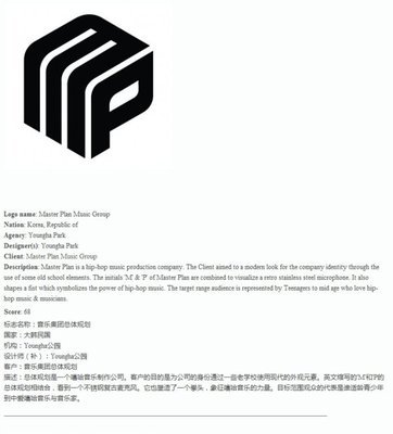
标志名称:桃红
国家:斯洛文尼亚
机构:阿马达
设计师(补):Teja公司Kleč,达科Miladinović
客户:桃红四岛岛
描述:桃红是与著名的具有长久的传统行李配件商店的品牌名称。新的平面设计元素是一个典型的识别旅行 -一个折纸鸟,线索的方式在世界各地的客户。波导折叠整齐,你作为你的遗物时折为您的旅途包。
_________________________________________________________________________________________________
Logo name: Johnson Controls logo
Nation: United States
Agency: Lippincott
Designer(s): Rodney Abbot, Christian Dierig, Bogdan Geana
Client: Johnson Controls
Description: Johnson Controls unique ability to create appealingenvironments for customers across many areas of their lives—homes,cars and offices is expressed in the design of the new logo. Thesymbol represents vitality and energy. The interweaving rings or“waves”, reflect the exchange of ideas, dialog and engagement withcustomers and employees. The abstraction of the initials “JC“ canbe read as the movement of air, the transfer of energy, interactionand wireless transmission… recalling core elements of thebusinesses.
Score: 63
标志名称:江森自控徽标
国家:美国
机构:利平科特
设计师(补):罗德尼住持,基督教Dierig,波格丹Geana
客户:江森自控
说明:江森自控能力,创造独特的呼吁在他们的生活,住房,汽车和办公室的许多领域,是在新徽标的设计表示客户环境。符号代表的活力和能量。交织环或“浪”,反映了思想,对话和与客户和员工的参与交流。该缩写“赛马”,可作为空气流动,能源,互动和无线传输传输读取...回顾企业的核心元素抽象。
_________________________________________________________________________________________________
Logo name: Environmental Curriculum Service
Nation: United Kingdom
Designer(s): James Tredray
Client: Wide Horizons
Description: The Environmental Curriculum Service delivers awhole range of outdoor and environmental education provision forschools, colleges and other educational establishments.The simplebrief was to revamp the old oak tree logo and make it softer, moreyouth friendly than the previous mark. Using simple circular shapesthe designer created the tree using the ECS initials.
Score: 64
标志名称:环境课程服务
国家:英国
设计师(补):詹姆斯Tredray
客户:宽视野
说明:环境课程服务提供了户外和环保为学校,学院和其他教育establishments.The简单简短提供教育整体改革的范围是在老橡树标志,并使其更柔软,比以前更多的青年友好标记。使用简单的圆形状的设计师建立的树用精英的缩写。
_________________________________________________________________________________________________
Logo name: Marienorgel Witten
Nation: Germany
Agency: Claudius Design
Designer(s): Stefan Claudius
Client: KatholischeKirchengemeinde St. Maien Witten
Description: The Church of Witten is building anew organ, which will be one of the largest in the region. Part ofthe publicity campaign is the logo. It is based on the labiums ofthe visible flutes of the new organ. Labiums are the source of thesound of an organ. In the logo they stand for musicality, bringingin mind the flow of music. The organ’s colours will be red andwhite.
标志名称:Marienorgel威滕
国家:德国
机构:克劳迪斯设计
设计师(补):斯特凡克劳迪斯
客户:Katholische Kirchengemeinde圣Maien威滕
说明:威滕教会正在建设一个新的器官,这将是该地区最大的之一。的宣传运动的一部分,是标志。它是根据新的器官可见笛子的labiums。Labiums是一机关声源。会徽中的音乐,他们主张,考虑为推动音乐流。该机关的颜色将是红色和白色。
_________________________________________________________________________________________________
Logo name: ACCEDE
Nation: Spain
Agency: Valladares diseño y comunicacion
Designer(s): Pepe Valladares, Giovanni Vega
Client: Deloitte S.L.
Description: Logo for the “Sistema de Informaciónde la Ley de Promoción de la Autonomía Personal y Atención a lasPersonas en Situación de Dependencia”, an information system thathelps to apply a law by promoting the attention on people independance situations
标志名称:爱可信
国家:西班牙
机构:设计和沟通Valladares
设计师(补):佩佩Valladares,乔瓦尼维加
客户:德勤sl的
说明:标识为“信息系统的法律对个人自主权和护理依赖者推介会”,一个信息系统,有助于促进依赖的申请依法由人民注意的情况
_________________________________________________________________________________________________
Logo name: Ulitka (Snail) Hotel
Nation: Russian Federation
Agency: altapress
Designer(s): Alexey Shelepov
Client: Altan
Description: The snail went off on a journey - leaving itsshell. The mollusk transforms into arabesque image of a doorlockkey. Even though today all rooms in the hotel open with electronickeys, the image of traditional key is still a very convincingsymbol of hotel business. Moreover, the historic image of a key hasalways been used as a city symbol.
标志名称:Ulitka(蜗牛)酒店
国家:俄罗斯联邦
机构:altapress
设计师(补):阿列克谢Shelepov
客户:俺答
描述:蜗牛去了一个旅程 -离开它的外壳。软体动物转变成一个门锁钥匙蔓藤花纹的形象。虽然今天在酒店用电子钥匙打开所有的客房,传统的形象仍然是一个关键的酒店业务非常有说服力的象征。此外,一个关键的历史的形象一直被用来作为一个城市的象征。
_________________________________________________________________________________________________
Logo name: Helga
Nation: Ukraine
Agency: Graphic design studio by Yurko Gutsulyak
Designer(s): Yurko Gutsulyak
Client: Helga
Description: Helga is a language learning centre.The sign was inspired by crystal image and science fiction ideas,where crystal is associated to accumulating and storing informationor knowledge, and also encourages mind reading. So it contributesto mutual understanding and communication. In such a way crystalreflects language essence and functions. This sign suits thelanguage learning center perfectly.
Score: 56
标志名称:埃尔加
国家:乌克兰
机构:图解Yurko Gutsulyak设计工作室
设计师(补):Yurko Gutsulyak
客户:埃尔加
说明:埃尔加是一门语言学习中心。该标志的设计灵感来自水晶影像和科幻小说的想法,其中晶体相关的积累和储存信息或知识,并鼓励心灵感应。因此,它有助于增进相互了解和沟通。在这种方式反映了语言的本质晶体和功能。这个标志适合的语言学习中心完美。
_________________________________________________________________________________________________
Logo name: BrightHeart logo
Nation: United States
Agency: Lippincott
Designer(s): Rodney Abbot, Sam Ayling
Client: BrightHeart Veterinary Centers
Description: A group of investors and specialist veterinariansdeveloped a national chain of specialty clinics and requested a newbrand. The logo is an inspired depiction of a pet’s toy, evokingboth the restoration of health and the playful moments when humansand animals joyfully interact. The suggestion of medicalprofessionalism is enhanced through crisp typography, and a cleanlayout. Silhouette photography against a bright, white backdrop,enhances the sense of dedication and focus. Combined, thethoughtful placement of image and symbol completes the picture ofthe pet’s journey to good health, as the animals are seen activeand engaged.
标志名称:BrightHeart标志
国家:美国
机构:利平科特
设计师(补):罗德尼住持,山姆艾林
客户:BrightHeart兽医中心
说明:对投资者和兽医专家小组制定了全国连锁的专科诊所,并要求新的品牌。这个标志是一个宠物的玩具启发的描述,同时唤起恢复健康,活泼的时刻,人类和动物的快乐互动。由于医疗专业的建议是通过清晰的排版增强,以及一个廉洁的布局。对一个明亮的轮廓,白色背景摄影,增强了奉献意识和重点。相结合,其形象和象征周到安排完成了对宠物的健康之旅照片,像动物被视为积极参与。
_________________________________________________________________________________________________
Logo name: RJ Partners
Nation: Netherlands
Agency: Millford Brand-id
Designer(s): Jeroen de Kok
Client: RJ Partners
Description: The company RJ Partners BV inAmsterdam has it roots in the finance market. The core business iscorporate finance and investment management. The two owners havemuch experience in this market and decided to bundle theirknowledge. The logo refers to a small tree because the company issmall. Although the company is small, the knowledge cannot beunderestimated. The roots visible in the logo are deeply rooted andhave many ranches. This refers to the knowledge and big network ofthe company. 标志名称:个RJ合作伙伴
国家:荷兰
机构:米尔福德品牌的ID
设计师(补):吉荣德角
客户:个RJ合作伙伴
说明:本公司的RJ伙伴BV公司在阿姆斯特丹有它在金融市场根基。公司的核心业务是企业融资和投资管理。两位业主在这个市场很多经验,并决定捆绑他们的知识。这个标志是指一种小乔木,因为公司小。公司虽然小,知识不能被低估。在标志的根源是根深蒂固,可见有许多牧场。这是指以知识和公司的大网络。
_________________________________________________________________________________________________
Logo name: eko_unia
Nation: Poland
Agency: logotypy.com
Designer(s): Marcin Lagocki
Client: eko_Unia
Description: Eko_Unia is an organisation involvedmainly in education about ecology and natural environment. Eko_Uniaalso organises teacher-oriented workshops about ecology, recycling,etc.
标志名称:eko_unia
国家:波兰
机构:logotypy.com
设计师(补):马尔钦Lagocki
客户:eko_Unia
说明:Eko_Unia主要是在大约生态和自然环境教育工作的组织。 Eko_Unia还组织有关生态,环保等教师为导向的讲习班
_________________________________________________________________________________________________
Logo name: Vale logo
Nation: United States
Agency: Lippincott
Designer(s): Connie Birdsall, Adam Stringer,Daniel Johnston, Brendán Murphy, Carlos Dranger, Isa Martins
Client: Vale
Description: Vale is the second largest miningcompany in the world and one of Brazil’s biggest and most admiredcompanies. It’s new visual identity aims to consolidate its imageas a Brazilian company and increasing global presence, highlightingits distinctive position. The symbol, a "V" monogram, conveysvisual qualities of landscape, discovery, mining and a circular,reciprocal type, motion — strength, elegance and humanistic in asingle expression, Brazilian in its colorization.
Score: 78
标志名称:谷标识
国家:美国
机构:利平科特
设计师(补):康妮伯德索尔,亚当斯特林格,丹尼尔约翰斯顿,布伦丹墨菲,卡洛斯Dranger,伊萨马丁斯
客户:淡水河谷
说明:淡水河谷是世界第二大矿业公司和巴西的规模最大,最受尊敬的公司之一。它的新形象标志的目的是巩固和提高巴西公司全球业务的形象,突出其独特的地位。符号,一个“V”字母组合,传达视觉景观特质,发现,挖掘和一个圆形,互惠型,运动- 在一个单一的表达强度,优雅和人性化,在其着色巴西人。
_________________________________________________________________________________________________